Good Visualizations:

Source: Cover of Independent, U.K., Jul 21, 2006
http://www.smashingmagazine.com/2008/01/14/monday-inspiration-data-visualization-and-infographics/
Explanation and background:
The visualization is simply the cover of the U.K. magazine Independent on July 21, 2006. On the day before, U.K. and the U.S.A. has rejected a UN call for immediate ceasefire in the Israel-Lebanon conflict, while most of the world backs up the UN call. Though the fact is simple and can be described by a few words, the editors chose a more active way to distribute the NEWS, while implying their attitude towards the fact that the U.S. and U.K. are insisting their own way.
Deconstruction:
The title (also acts as the capture) is a question asked for the audience. What’s new happened in Middle-East? Who backs immediate cease fire? The visualization lists the nations with the answer “Yes” and the nations with the answer “No”. Using national flag to represent a country is really a prevailing but effective method. In this specific circumstance, the number and area of nation flags creates an inevitable comparison which implies the decisions of the U.K. and U.S. government are against the whole world. Now, even people without sufficient knowledge of politics and current events will know that few countries but U.K. and U.S. didn’t back the ceasefire call, which would be very possible to attract the eyes of the audience.
Critique:
This is one of the best cover pages of magazine I’ve ever seen. There is two major reason why I like this visualization.
First, you might argue that the visualization didn’t give out much information. However, in spite of the simple information, the sharp contrast between the left and right side makes very strong impression, while also influent most of the audiences emotionally. Though the visualization is simply indicating some facts, I believe most of people will extract following message from it: A. Most of the world would back the ceasefire call in the middle-east; B. the U.K. and the U.S. government are against the ceasefire call. Questions will soon arise in some of the audiences: why are the U.K. and U.S. against the world? Is it another “national benefit” issue, or is it another event in which they want to display their power?
Second, it’s really simple. By simple, I mean the implementation of the visualization is really easy. It’s really amazing an easily made visualization can take such good effect.
I haven’t found any bad thing for this visualization. As the cover, it properly achieved its function: to attract audience, and to present the most important content in the magazine.
Bad visualizations:
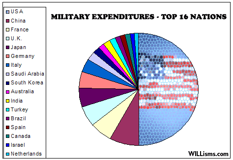
Source: http://www.willisms.com/archives/2005/03/the_american_em.html
Explanation:
This is a picture from the WILLisms NEWS website. It served as a figure for the comment article “ The America Empire”. The author is willing to use this figure to show the audience the military expenditures of the 16 nations who has the highest military cost. (Of course, the author’s major point is to point out America has the largest military expenditure, whose absolute value is almost the total summary of the other 15 top nations.
Deconstruct:
The figure is created based on a pie diagram which using different color to stand for different nations in this military expenditure competition, except for the U.S. For the U.S. partition, the author uses the national flag in a mesh background to emphasize. On the left, there is a color chart to correspond the nations and the colors in the pie diagram.
Critique:
The good thing is that the figure has a proper title and indicates its source.
However, the visualization is so bad that it against several basic principles for information visualization. Though the information it represents is straightforward, it cannot hardly be understand by the audience. It’s bad in following aspects:
- The colors for each nation are too many that they cannot be identified clearly. The figure attempts to challenge a person’s cognitive limit by the use of the 16 different colors.
- The use of the national flag with meshed background to emphasize the U.S. is confusing, and this abrupt style transforming makes the national flag hard to recognize by the audience.
- The details of the lines and color blocks of the pie diagram are not processed carefully. (See the jagged edge of the pie partition!) An ugly picture, comparing to a beautiful one, would be much harder for the audiences to accept.
In summary, the visualization Examining it with the principles for visualization design in Tufte paper, we can find that the paper does have sufficient data content, an integration of all the data and comparisons, however, the comparisons are too much so the major comparison is buried by redundant information. Based on the 4 level model of Munzner, we can confirm that the problem occurs at the abstraction level and visual encoding level, since the description for the problem and the algorithm is unlikely to be wrong.