Uncategorized

Another Simple Example

February 27, 2010

in Uncategorized

Here is a simple example of a trajectory (an evolution of the group).

In each case, we start out with things in 2 groups, and the nodes reconnect into 3 groups. There are 3 intermediate steps.

I have generated this data for two different network sizes (12 and 18).

To make things easier, I have not permuted the groups when things are divided into 3 (so, the groups are [0,1,2,3] [4,5,6,7] [8,9,10,11]). But I have also included cases where everything is permuted.

The file naming convention is: bg18pn_000_100.csv which means:

  • 18 = 18 node network
  • pn = start (2 groups) is permuted, end (3 groups) is not permuted (pp=both beginning and end are permuted)
  • 0% of the start
  • 100% of the end

Some examples:

Big ZIP of n=12,18,24, with and without permuted ends: bg.zip

Some simple examples

February 27, 2010

in Uncategorized

Here is the example I used to test my programs with.

There are 3 different “network configurations” (described in terms of cocktail parties of N people):

  1. There is a single host, that everyone knows. Everyone one also knows their two “neighbors” going around the circle.
  2. The party has 2 cliques (each of size N/2), each clique is like the first case.
  3. The same as the second configuration, except that each “non-host” also knows the corresponding person in the other clique.

Here are the three matrices for 3 different sized parties:

If you want all 9 files in one ZIP, download this.

This week’s lectures were conversations about low-level perception.

Mike’s Notes: 10-02-23-Perception101.pdf

Some of you have asked about what are the “expectations” for what you will create for the design challenge.

I have one very elegant solution to the design problem, but implementing the
idea may take longer than 4th March deadline. What is your expectation
in this work?

Clearly, it is easy to come up with designs that are too hard to implement. Indeed, its probably possible to come up with designs that are too much effort to really be worthwhile for the problem.

If you have an idea, you should try to prototype it. Prototype can have a wide range of meanings. From very “low fidelity” prototypes, to detailed implementations. If you have an idea that would be really hard to implement, maybe you’ll want to prototype it first using some simple mockup – pencil and paper sketches, or a storyboard of pictures of what it would look like. For other ideas, it might be practical to get an implementation such that you can try it out on real data.

There is a tradeoff: on one hand, its nice to have more ideas than you can implement, or fancier ideas than you can implement. On the other hand, there’s a lot to be said for being able to try your ideas on real data. There’s also something to be said for ideas that are easy to implement: if you have an otherwise awesome design that would be too time consuming (costly) to implement, in practice, that might be less useful than something that is more practical.

For March 4th, your focus should be on having ideas your ideas in a form that you can convey to the domain experts for feedback. It is more compelling if they can see things on real data (and “real” simulated data). But it might be just as (or more) compelling if you have a totally amazing design that you explain with pictures and good arguments.

My hope is that each group will do a lot of thinking and designing, and at least a little bit of implementing.

Here is another set of real data. This data comes from a single venue, and represents 4 “stories” that the students wrote over the semester (its 1,2,4,10). Is there a progression over time?

Some Real Data

February 23, 2010

in Uncategorized

Here is some real data for the design challenge.

These are 8×8 matrices (for an 8 concept epistemic frame). There were 3 sets of students (practicum, game, and course). Each of these matrices represents the average over all students in the set (known as venue) and all of the “stories” in the venue.

If you want, the labels for the 8 nodes (in order) are:

S_investigating
S_detailed_description
K_story
K_reporting
K_reader
V_informing_the_public
V_engaging_reader_story
E_rich_details

Design Challenge Teams

February 18, 2010

in Uncategorized

With 16 people, there is a team of 4 and 4 teams of 3.

While having a diverse set of people in class makes things interesting, it can also complicate teamwork since people are distributed all over campus. I do appreciate the efforts that people make in working togeher – hopefully the experience of collaborating with people from outside your field will make up for the inconvenience of having to deal with distance.

  • Albers, Danielle    Vack, Nate    Hinrichs, Christopher
  • He, David    Kishor, Puneet    Faisal, Khan    Moon, Jee Young
  • Hill, James    Liu, Ye    Huang, Shuang
  • Mayorga, Adrian    White, Jeremy    Watkins, Leslie
  • Turetsky, Emma    Kim, Nakho    Verma, Chaman Singh

We will provide time in class for teams to talk and coordinate.

My hope is that teams will work together to develop solutions to the challenge, but I understand that collaboration can be challenging. Having subsets of the the team develop solutions (leading to multiple solutions) that are then just combined into a coordinated presentation is OK if you really can’t find ways to work together.

This is a simple example of synthetic data, generated using the cocktail party simulator.

All of these data files come from the same network: a 12 person party with 1 host. All guests know the host and 2 other people (so D knows A (the host) and C and E (its two neighbors).

In the simulation, we add two factors:

sampling (how many observations do we take to build the matrix). in many cases, we are undersampling (not getting enough samples to really capture the phenomenon, which will lead to noisy measurements)

measurement noise (random chance added to the numbers). basically, this says that when we make an observation, there’s a chance it might be a random event (two people that do not know each other still may talk to each other, or two people are talking to each other, but we missed it)

This example should allow you to see how well your techniques deal with these two factors. The underlying phenomenon is the same (so we would hope to have very similar representations), but the errors might make that harder to discover.

The datafiles have the names formed as:

P 12 x 100 – 0 – 1

which means:

  • 12 person party (all these are the same)
  • x means that its the single host party (we’ll see other networks in future data)
  • 100 means 100 samples
  • 0 means no noise (6 means the +/- 3 noise added to each conversation selection)
  • 1 is the trial (there are two trials of each condition given)

Here is a ZIP of a bunch of these: p12x.zip (16 to be exact)

(right now, I can’t upload individual CSV files – but we’re working on fixing that)

There is a symposium about diagrams organized by the Center for Visual Culture on February 26th. You might be interested in it. http://www.visualculture.wisc.edu/Events/0910/visualitiesbeyondocularcentrism.html

The main readings for this class will be provided (they will come from papers, or book chapters that I can provide). However, I was going to use so much of Colin Ware’s book, that it defies academic fair use, so itis a required textbook.If you don’t want to buy it, it will be on reserve at Wendt library.

Required Textbook:
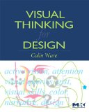
Visual Thinking: for Design, by Colin Ware. Published by Morgan Kaufman, 2008. ISBN-13: 978-0123708960. (amazon)

This is a fabulous book. We’ll use all of the chapters. The only downside is that it isn’t as comprehensive as his earlier book. But I picked this one since Information Visualization might be a little bit too much for some people.

There will be required readings from this book, but there will be alternates for those of you who buy Information Visualization instead.

Alternate Textbook:

Information Visualization, Second Edition: Perception for Design, by Colin Ware. Published by Morgan Kaufman, 2004. (amazon)

This was going to be my choice for the textbook, but I thought it might be a little much for most students. If you’re really into visualization, you probably want this book instead of Visual Thinking.

Another Useful Book


Visualizing Data. by Ben Fry. O’Reilly 2008.

This is less a book about visualization than it is about the process of doing visualizations and how to program in Processing. If you’re not a computer scientist, and you need to learn some simple programming to do some visualization, this book is a good place to start. Its more about working through the process of simple examples than giving you insights into visualization in general.

You don’t need to buy this book – UW has access to an online copy (here’s a link that accesses it through the proxy so it works off campus): http://ezproxy.library.wisc.edu/login?url=http://proquest.safaribooksonline.com/9780596514556

Recommended Reading

Tufte’s books are an essential guide to the design aspects of visualization. Its hard to justify them as textbooks. I have requested that they be put on reserve at Wendt.

The Visual Display of Quantitative Information, 2nd edition. By Edward Tufte. Graphics Press, 2001. (amazon)

Envisioning Information. By Edward Tufte. Graphics Press, 1990. (amazon)

Visual Explanations: Images and Quantities, Evidence and Narrative. By Edward Tufte. Graphics Press, 1997. (amazon)

Beautiful Evidence. By Edward Tufte. Graphics Press, 2006.  (amazon)

At the surface, Scott McCloud’s books seem to be about comics. But, if you dig deeper, you realize that he has a lot of amazingly insightful things to say about visualization in general.

Understanding Comics: The Invisible Art. by Scott McCloud. Harper, 1994(amazon)

I don’t think people would take me seriously if I made this a textbook. But you’ll learn a ton by reading it. It will help you rethink what visual communication is about. His new book seems good too, but I am just reading it now.

Making Comics: Storytelling Secrets of Comics. by Scott McCloud. Haper, 2006.