Visualizing Validation of Protein Surface Classifiers
Alper Sarikaya, Danielle Albers, Julie C. Mitchell, Michael Gleicher
A full paper describing this project has been accepted to the Eurographics Conference on Visualization
(EuroVis '14, 10-13 June 2014)
DOI | PubMed | UW Graphics Group Publication Entry
Introduction
This work seeks to create a better visual understanding performance of machine learning models that operate over a corpus of proteins. These classifiers typically try to predict where certain ligands bind to help in protein characterization (determining the function of a protein). The visualization seeks to combine summary judgments of performance over the corpus with a detailed view that shows performance on the three-dimensional surface of the protein.
Understanding how the performance of a trained classifier varies over a labeled test data set (corpus) can be difficult. The typical strategy of using summary statistics (accuracy, recall, F1 score, etc.) to determine the performance of a classifier leaves out critical data needed for comprehensive analysis of the classifier output. Which proteins does the classifier not accurately classify? What trends of performance can be seen across the corpus? How does this relate to metadata of the proteins? (e.g. size) How does the classification performance manifest itself on the three-dimensional structure of the proteins in the corpus? Are there any spatial trends that impact classification performance? Our visualization tool strives to answer these questions and more.
We encode classifier performance by using the binary confusion matrix, which separates predictions into four outcomes: true positive (TP), false positive (FP), true negative (TN) and false negative (FN). We represent these classification values as colors: TP is green, FP is blue, TN is gray, and FN is red. This color encoding is consistent across the visualization.
The following images display the output of a published DNA-binding classifier [1], where predictions are made on a surface residue granularity.
The visualization is separated into two views: the overview that displays each protein in a small multiples format, and the detail view that shows the classifications embedded on the surface of the protein.
Overview
The overview presents the performance of the classifier segmented for each protein in the corpus. Each grid element represents a single protein chain for which the classifier has operated over. The border of each element encodes the MCC summary statistic, where darker is better performance over chance. The user has a choice over how the data in each glyph is displayed; different types of encodings can offer different types of judgments.
Change the below image using the radio buttons to the right of the image to see the different summary glyphs.
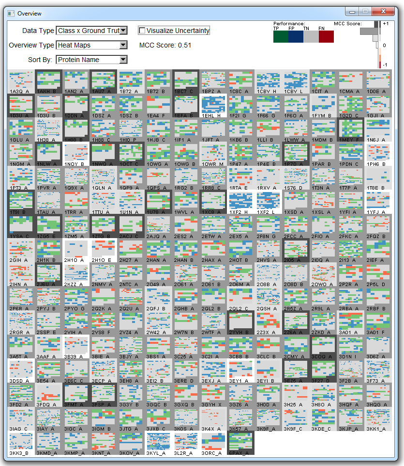
The user can also sort the corpus by different metadata of the proteins, including the PDB name (lexigraphically), number of residues, the MCC score, the number of positive ground truth labels, or sensitivity/specificity of each protein.
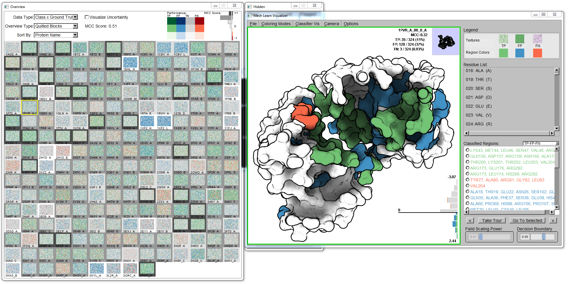
Detail view
The user can click on any glyph in the overview to bring up that protein's molecular surface and classifications in the detail view window. The classification types (TP, FP, TN, FN) are mapped to the surface of the protein to match the positions of the predicted elements, whether they be residues or surface descriptors. The classifications are clustered based first on connected components on the labeled vertices of the triangle mesh (of the molecular surface), then the regions are smoothed by the morphological operations of dilation and erosion.
Change the below image using the radio buttons to the right of the image to see the different encodings of classification performance and input features.
The user can navigate the molecule by panning, zooming, and rotating the camera around the molecular surface to see all the detail on the molecule. To assist the user in seeing all classifications, each cluster is itemized on the right-hand side of the molecular visualization. Selecting a region, the user can requset to bring a region into view: the camera is then smoothly navigated to an ideal viewpoint of the requested region from the current viewpoint.
The user is also presented with a horizontal histogram (bottom-right of the viewport) that shows the distribution of classifications in predictive space. The bars are colored such to encode the classification values. The user can change the decision boundary (bottom-right slider) to dynamically reclassify the classification values.
To bring the input features of the classifier into the context of the classifications, we create a bivariate encoding that utilizes color to encode a specific continuous feature and texture to encode the classification values. In the image above, a color field encodes electrostatic potential of surrounding residues. The textures encode the classifications (checkered for TP, grid for FP, Perlin noise for FN). This juxtaposition allows the user to make judgments of the correlation between a continuous feature and the resulting classification performance.
The horizontal histogram changes to encode the distribution of the purple-green color ramp over the domain of the currently selected feature. The user can change the transfer function to the color ramp by manipulating the 'field scaling power' slider to refocus the color ramp at a different point in the feature domain.
Use Cases
1. DNA-binding classifier
As described in the paper, the DNA-binding classifier (DBSI) [1] is a residue-granularity classifier. Over 219 proteins in the dataset with sizes of 41 to 932 residues are encapsulated in the result dataset that comprises the output of the classifier.
2. Calcium-binding classifier
The calcium-binding classifier [2] operates on a mesh vertex-based granularity, resulting in anywhere from 10,000 to 65,000 decisions per protein. This particular dataset is a small 11 proteins, but encompasses a substantial number of decisions.
3. Affect of Mutagenesis on Binding Affinity
This dual classifier (one for disruptive effect, one for favorable effect) tries to capture how mutagenesis of particular residues can affect binding propensity for particular proteins.
Prototype
We have developed a C++ prototype for this system, which is compiled for Windows. Both the Microsoft C++ 2008 (x64; x86 here) and 2010 (x64; x86 here) runtime distributables are required for the successful execution of the prototype. If you have Visual Studio 2008 or 2010 installed on your system, you do not need the respective distributables.
- The Executable (362 MB) — If you're interested in running the visualization, download the compiled binaries; all necessary compiled dependencies are included. Please read the README.txt file for necessary setup steps. All use case data is included.
- The Code (2 MB) — If you're interested in looking at the code, feel free to download the Visual Studio solution. The README.txt file has information about how to set up the development environment to include external dependencies for compilation. We can provide the necessary dependencies on request (650 MB).
-Alper Sarikaya (sarikaya@cs.wisc.edu)
References
[1] X. Zhu, S. S. Ericksen, J. C. Mitchell. DBSI: DNA-Binding Site Identifier. Nucleic Acids Research 41, 16 (2013), e160.
[2] G. Cipriano, G. N. Philips, M. Gleicher. Local functional descriptors for surface comparison based binding prediction. BMC Bioinformatics 13, 1 (2012), 314.
Last Updated 24 October 2014 (added DOI/PubMed links)