The data is interesting, I’m not too keen on the circular design, but the information here is good food for thought:
http://www.informationisbeautiful.net/visualizations/colours-in-cultures/
Visualization10 - CS838 Course Web
Course web for CS838 Spring 2010, Visualization
The data is interesting, I’m not too keen on the circular design, but the information here is good food for thought:
http://www.informationisbeautiful.net/visualizations/colours-in-cultures/
If you have a great narrative, all the visualization tool you really need is… some Lego bricks.
http://www.gapminder.org/videos/population-growth-explained-with-lego/
An infographic website companion to the radio show “This American Life.”
http://tai.ejfox.com/
The Design for America contest is challenging the community to come up with information visualizations of some available government data.
The first 3 challenges (in the “Data Visualization” category) might make good final projects. (info on that coming soon)
This is a collection of some nice tutorials on topics related to photography. Some of the concepts related to color in photographs are explained with visual illustration. These can be very helpful for understanding color for our purposes as well.
http://www.cambridgeincolour.com/tutorials.htm
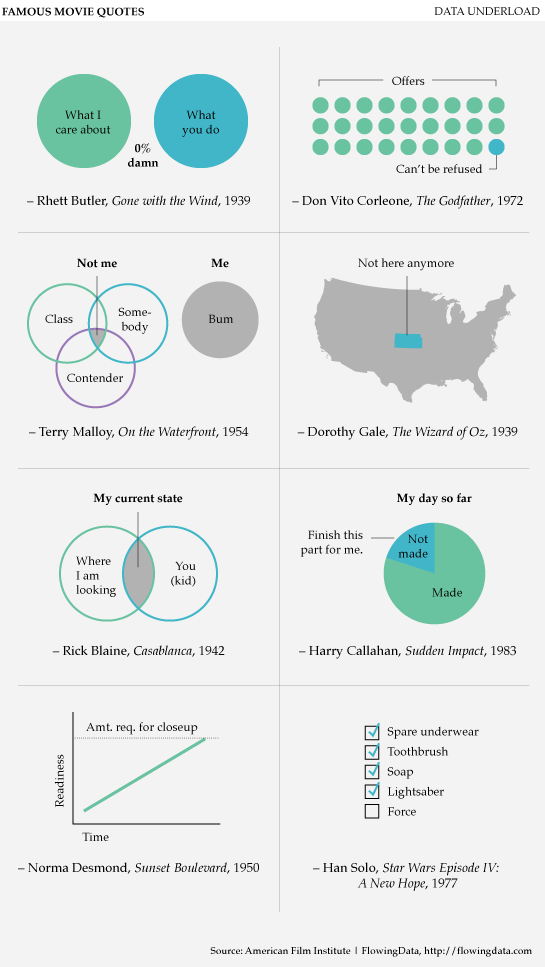
Pretty funny… can we come up with more?
http://flowingdata.com/2010/03/08/data-underload-12-famous-movie-quotes/