4/16/2017 – Additional Explanation of Phase 3
3/17/2017 – First version posted, missing links for handins
The first Design Challenge gave you real data and encouraged you to make design with real tools – but many people skipped the sketching phase. This design challenge emphasizes the sketching / drawing by hand parts. We’ll have 2 separate problems that you’ll work on over the next 3 weeks. (The third challenge will have real data again, and let you do some implementation if you are so inclined)
This Design Challenge has two main parts. One was a Design Challenge in 2015 (although we have modified it a little). The other was an in-class exercise in 2015 that took too long for an ICE, so we’ll do part of it as part of the design challenge.
Schedule
Challenge begins: (officially) March 27 – although you can start as soon as you read this. All you need to do Phase 1 is in this posting.
Phase 1: Initial Designs and Analysis of Airline Route Maps (due Tuesday, April 4) – since we’ll tell you things on Wednesday April 6 that will influence what you do.
Phase 2: Final Designs and Analysis for Airline Route Maps (due Tuesday, April 11)
Phase 3: Initial Designs for Problem 2 (“The Paris Apartment Problem”) (due Tuesday, April 18 – but DC3 will start on April 17)
Phase 4: In-Class Critiques and Design Iteration on Problem 2 (date TBD, probably April 26)
Note that Phases 1 and 2 are independent from Phases 3 and 4.
Phases 1 and 2: Airline Routes
The goal of this assignment is to give you some practice at applying the basic ideas we’ve learned about visualization and graphic design. The idea is to pick a simple “data visualization” problem that you’ve probably seen, try to understand the task, think about the standard designs with respect to these tasks, try to invent some new designs to address tasks, practice critiquing designs, and to think about evaluation.
The specific problem chosen (Airline Route Maps) is hopefully simple enough in terms of its domain, that everyone is enough of an “expert user.” You might see it as a cartography problem (since the standard solutions are maps), but it can be seen more broadly. The data itself is a network (in terms of abstract data type), and we won’t talk about network approaches until later in the class. You can read ahead (Chapter 9 of Munzner’s book is a good start), but you can also try to build off the basic principles you already know.
For this challenge, we won’t actually provide the real data. We just want you to think about the problem in the abstract, and make the designs as “data sketches” (with made up simple data). So, when you create a design, you can make up a fictitious airline – but give it the kinds of properties that show off the challenges and solutions.
Also, for this challenge we want you to create your designs by hand. We encourage you to do everything on paper (with pens, markers, colored pencils, …). If you want to draw on a computer, that’s OK, but you will need to print things out. Conversely, at one step, you will need to get your paper design into the computer – but we’ll help with that.
The Traditional Design
You’ve probably seen an airline route map in the back of the magazine on an airplane. Usually it’s a map, with points for cities, and arcs (or curved edges) connecting city pairs with flights.
Here are the pages from the Delta in-flight magazine (click for scanned PDF):
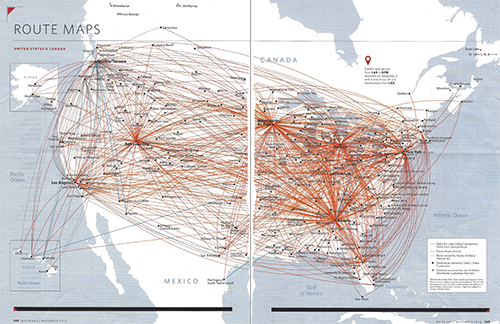
Here is one for United that I found online (click to Zoom):
There’s a website http://www.airlineroutemaps.com where you can see lots of these. If you dig, you can probably find some non-traditional designs (but don’t look too hard for them – the idea is for you to come up with alternative designs yourself). Here’s one for United, Allegiant (a smaller US Carrier)…
They’re not all this bad… But when an airline has lots of flights to lots of cities, showing this information gets tricky!
What’s the Data? What’s the Task?
Hopefully, those are the first two questions that you are asking.
Part of this assignment is for you to figure this out. So, before you read further (spoiler alert), think about those questions. For task, you can probably think of lots of things you might want to do with “this data.” So we need to define this data.
Have you thought about what the data is yet?
For this assignment, we limit ourselves to the route connection data. That is, all we know is a list of the city pairs the airline flies between. Just a yes or no – does the airline fly between those two cities. We can have some extra info (like where the cities are on the map) if we need it for making pictures.
As far as tasks – think about what you might want to do with information about what routes an airline flies.
The Design Challenge
Here are the things we need to do:
For the first phase, we need to consider what the tasks are for this data, and use that to come up with some initial designs. You’ll create a list of possible tasks for a “map” made with this data, critique the standard design, and come up with 1-2 new designs of your own.
For the second phase, you need to come up with 2-3 different designs (that are not the standard design).
All of your designs (minimum 3 total) need to be “different” from the standard design, from each other, and from the ones discussed in class (unless you come up with the one from class before we reveal it. There’s a question as to what constitute “different” (from the standard design, or from each other). Hopefully, you can come up with something that is “obviously” very different. A baseline rule of thumb: if the brief description of one would apply to the other, then maybe they aren’t different. Of course, you can explain why a design is different (from the standard, or from your other designs).
You need to come up with at least 3 different designs (1 for part 1, 2 for part 2). You may turn in up to 5. If you turn in more than 3, we will only pick the best 3 to look at. That said, designers often like to work by trying lots of designs, so you might want to make lots of different ideas, and just write-up/hand-in the 3 you think are best.
To help you in thinking about creative solutions for phase 2, we’ll show you (at least one) clever design for a specific task (probably in class, but maybe via the web) on April 5th (after you do part 1).
For each design, hand in a separate PDF file (1 PDF per design) that has: (and note – you need to turn in more than just the designs)
- A rationale for the design (this should explain what tasks you are trying to address). You may acknowledge tasks that you cannot do with your design
- A description of the design
- A picture (or pictures) – these are probably sketches, based on “fake data.” But try to convey the essence. You might not be able to draw all arcs, or …
- Do not put your name in your PDFs. We might do peer review.
Some thoughts on design:
- Part of the challenge is that these maps are printed, so they are static images. At least 2 of the designs you turn in need to work in this form (e.g. they can go in the in-flight magazine). So, if you want to have a dynamic or interactive design, you can throw one in.
- We haven’t specified what airline, so you don’t have data. Imagine a fictitious airline with a network similar to one of the major US carriers (look at the United and Delta examples). It would have a few hub cities scattered around the country. It would fly to most major (and most minor) cities from at least one of these hubs. If you want to make assumptions about the airlines routes, or have specific ideas in mind, feel free to describe it in the design descriptions.
- We recommend making sketches of your design. Print out a blank map (link here, bl.ock here) – or start with a blank page. (hint: not all designs have to be geographic maps). You can sketch on a computer if you prefer (using a drawing tool). But what we want is the picture. Remember, the goal is to create a “sketch” that conveys the essence of your design, not to make a beautiful example of it. It needs to be good enough that (combined with the description), someone can understand it and critique it.
- Hopefully, you’ll recognize this as a graph visualization problem and use some of the ideas from graph visualization.
- It’s OK to make visualizations that are task specific. Just be sure to describe the task.
What to turn in for Phase 1 and 2:
For Phase 1: (turn in on Canvas (link), Tuesday, April 4 – since on Wednesday April 5 we’ll give you some hints for Phase 2).
- Turn in a list of tasks you can think of that you can think of wanting to do with one of these maps. This is connected to your “critique” of the standard design (e.g. the United and Delta maps shown above).
You need to identify some tasks the standard design is good for, and some tasks the standard design is not good for. You might present this as two lists, or you might put a comment with each element of the task. - A brief critique of the standard design – what are it’s good and bad points. Some of this is in the task lists above.
- At least 1 design. It must have the 4 parts described above. It should address some of the tasks in your list.
For Phase 2:(turn in on Canvas (link), Tuesday, April 11)
- You need to turn in at least 2 designs. For a total of up to 5 (including what you turned in for Phase 1).
- If you want to update your task list from Phase 1, you can. Turn it in as part of Phase 2.
Note: Do not turn in designs for Phase 1 late. If you don’t turn in a design for Phase 1, turn in an extra one for Phase 2.
Evaluation: We will provide a rubric for how we will evaluate your designs. In 2015, we provided a rubric for students to do peer evaluation – we may follow a similar structure for our assessment. We may (or may not) do peer evaluations.
Phase 3 and 4: The Paris Apartment Problem
For phase 3 and 4 of the Design Challenge, we’ll look at a different design problem, and we’ll approach it a little bit differently. We’ll ask you to think about the problem and turn in some initial designs, but we’ll do the final designs as an in-class exercise.
In this problem, the data is information about restaurants in a city. (imagine Paris) They all have a location on the map, and they all have a set of attributes (cuisine, price range, star rating, open late, …)
The reason that this is called the “Paris Apartment Problem” is that the first task we considered in class in 2015 was the problem of picking an apartment that had good proximity to good food. We also considered a different problem of making glyphs (symbols) that encoded information about restaurants so we can put dots on a map. Both of these were in-class exercises. In both cases, students wanted more time than they had in class. So this year, we’re going to make it a hybrid (start at home) assignment, and put the two parts together.
There Paris Apartment Slides that I made for that last class that give some aspects of the problem. A little more explanation below.
For this year’s design challenge I want you to consider both challenges seperately:
- Design glyphs (small symbols that could be placed on a map) that encode various attributes of the restaurants in the symbol. You need to design (at least) 3 different glyph designs – and you get to choose the task for each.
- Come up with a design (at least one) that is not just symbols on the map that addresses the specific “compare the apartments” problem.
For this phase of the assignment, you need to turn in at least 4 designs (3 glyph designs, each with a task, and one non-map-based design for the apartment task). You can turn in up to 5 glyph designs and up to 3 non-map designs.
Glyph designs should describe the task the design is meant to serve. It should describe the encodings. It should have a sketch of some examples.
Non-map designs should have a sketch (or sketches), and a description (especially if the sketch requires interpretation).
We’ll provide some simple examples of each (coming soon).
For phase 3, you will turn these designs in (each design as a separate PDF) via a Canvas link. Phase 3 is due on Tuesday, April 18th (in keeping with our “DC due on Tuesday” tradition).
For phase 4, you will bring your designs to class on paper. Each table will critique the different designs that people bring, and use those to make a “best” design to show to the whole class.
Additional Explanation for Phase 3: (added 4/16):
The problem is to compare two apartments – considering their proximity to restaurants.
if you prefer…
Compare the restaurants around two different locations.
Here’s a non-visual, non-map, simple “textual visualization” that doesn’t provide all the information that a good assignment could. (fake data of course)
Apartment A:
3 block radius: 3 bakeries, 4 restaurants (2 expensive, 2 cheap)
6 block radius: 7 bakeries, 9 restaurants (4 expensive, 5 cheap)
Apartment B:
3 block radius: 2 bakeries, 3 restaurants (1 expensive, 2 cheap)
6 block radius: 5 bakeries, 8 restaurants (2 expensive, 7 cheap)
The obvious design is a map with glyphs for restaurants (which is why you have to design glyphs for part 3.1). But the textual version might give you a sense that there are alternatives that more directly address the tasks (part 3.2 and 4).