Getting Started with TextDNA
This guide provides a brief overview of how to explore data with TextDNA using the Top 1000 Google N-Grams Dataset. TextDNA is intended to support the high-level analysis of large sets of sequence data. The tool leverages overview visualization techniques to display aggregate trends across the dataset based on statistical and user-defined properties of the data to support high-level comparison tasks. Interaction techniques allow the user to explore detailed information within the context of the overall dataset.
This guide demonstrates how to use the features provided in TextDNA to find patterns at multiple scales. The first example demonstrates how to use the tool to explore a significant typography shift within the dataset. The second example demonstrates the use of reference comparison to identify specific terms of interest. For more information on the design of the system, please see the original Sequence Surveyor system paper: Sequence Surveyor: Leveraging Overview for Scalable Genomic Alignment Visualization. For a comprehensive guide on the features of the system, please visit the User's Guide.
Looking into the Long S
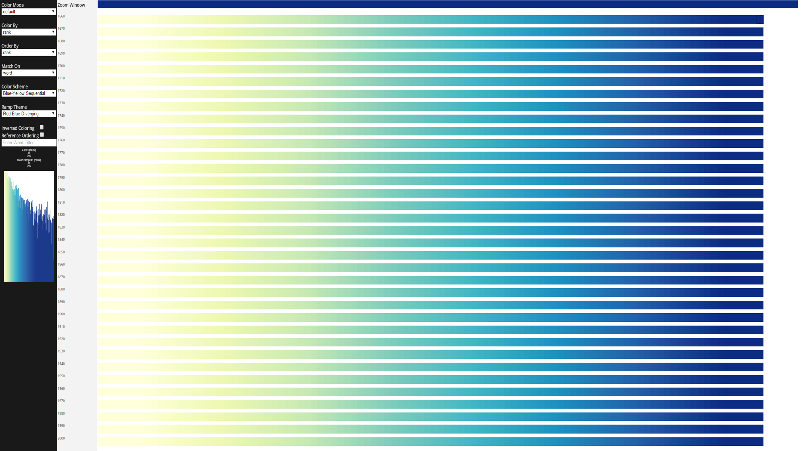
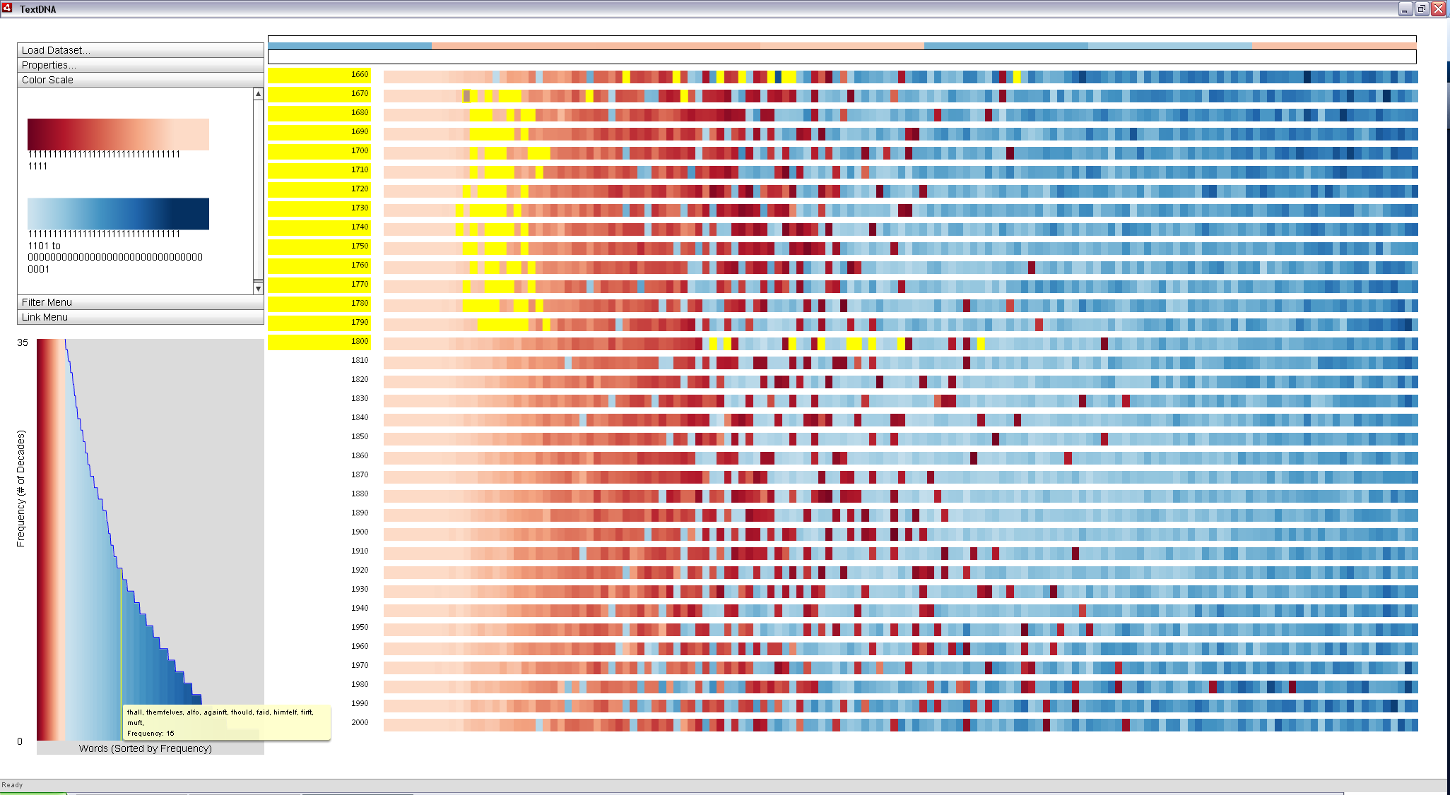
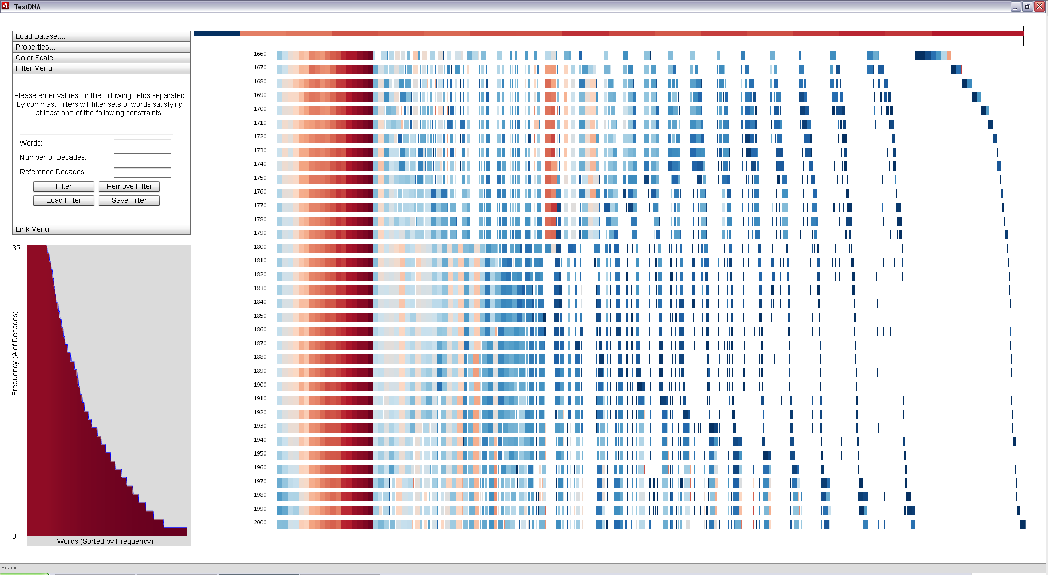
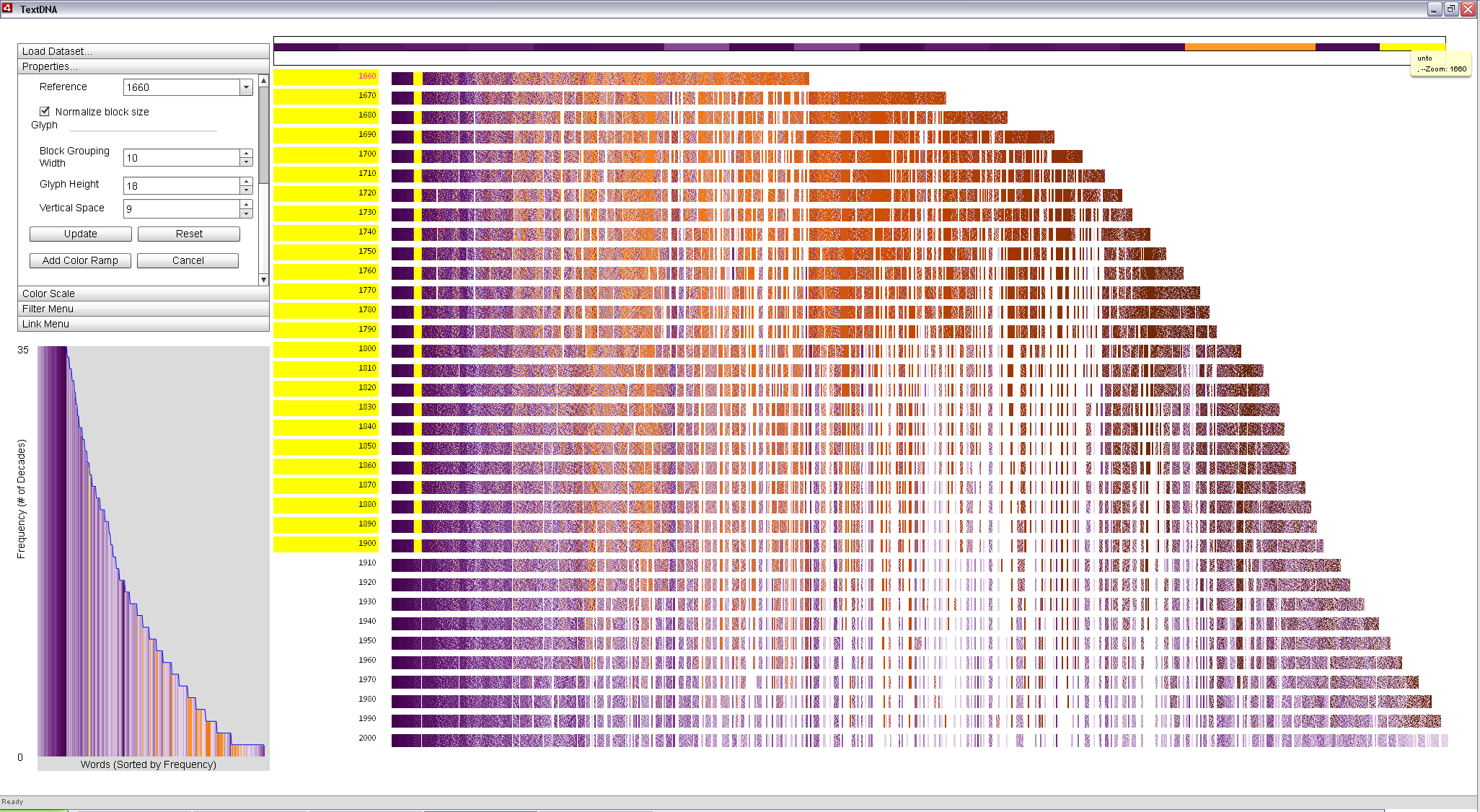
The image below shows the default view in TextDNA visualizing the top 1,000 most popular words per decade since 1660 according to the Google N-Grams dataset. The decades are ordered chronologically from top to bottom, with each decade represented as a single row.
Words are represented as colored blocks within each row. Their ordering and coloring in each row is reflective of their popularity, with the most popular at the left and the 1,000th most popular word on the far right (a Rank x-axis ordering).
Changing coloring to use the Red-Blue Diverging color ramp and coloring by Grouped Frequency colors words according to their co-occurance patterns, with reds representing words among the 1,000 most popular in each decade of the dataset and blues representing words found in the top 1,000 most popular in an increasingly smaller subset of the decades (coloring by Grouped Frequency Ordering). Each unique subset of decades maps to a unique point along the color ramp. The words and their color mappings can also be explored in the histogram view, ordered according to their overall frequency within the dataset.
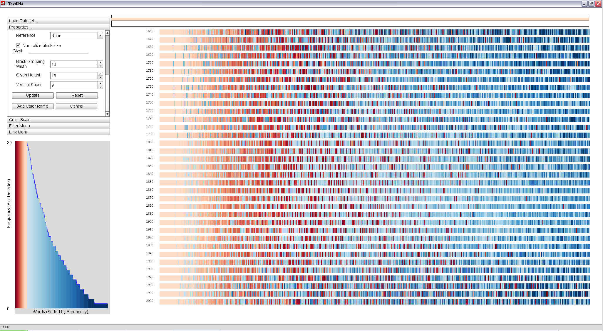
Words are grouped together into 10 pixel-wide regions called blocks. The number of terms within each block is dependent on both the size of the sequence (i.e. the number of words in the decade), the size of the TextDNA window, and the width parameter set by the user in the Properties Menu (10 pixels by default). Each block is represented as a solid rectangle colored according to the co-occurance value within the block (an Average aggregation scheme).
In this default view, the leftmost side of the display is entirely pale red, indicating that the top 100 words in each decade all appear to occur in every other decade. The relative uniformity of this pale red coloring among the first 100 words across all decades seem to suggest that, in general, the top 100 words and their order are relatively constant across all 35 decades in the dataset.
|
| The default view of the 1,000 most popular words per decade from 1660 to 2010. Decades map to rows and words map to colored blocks within each row. |
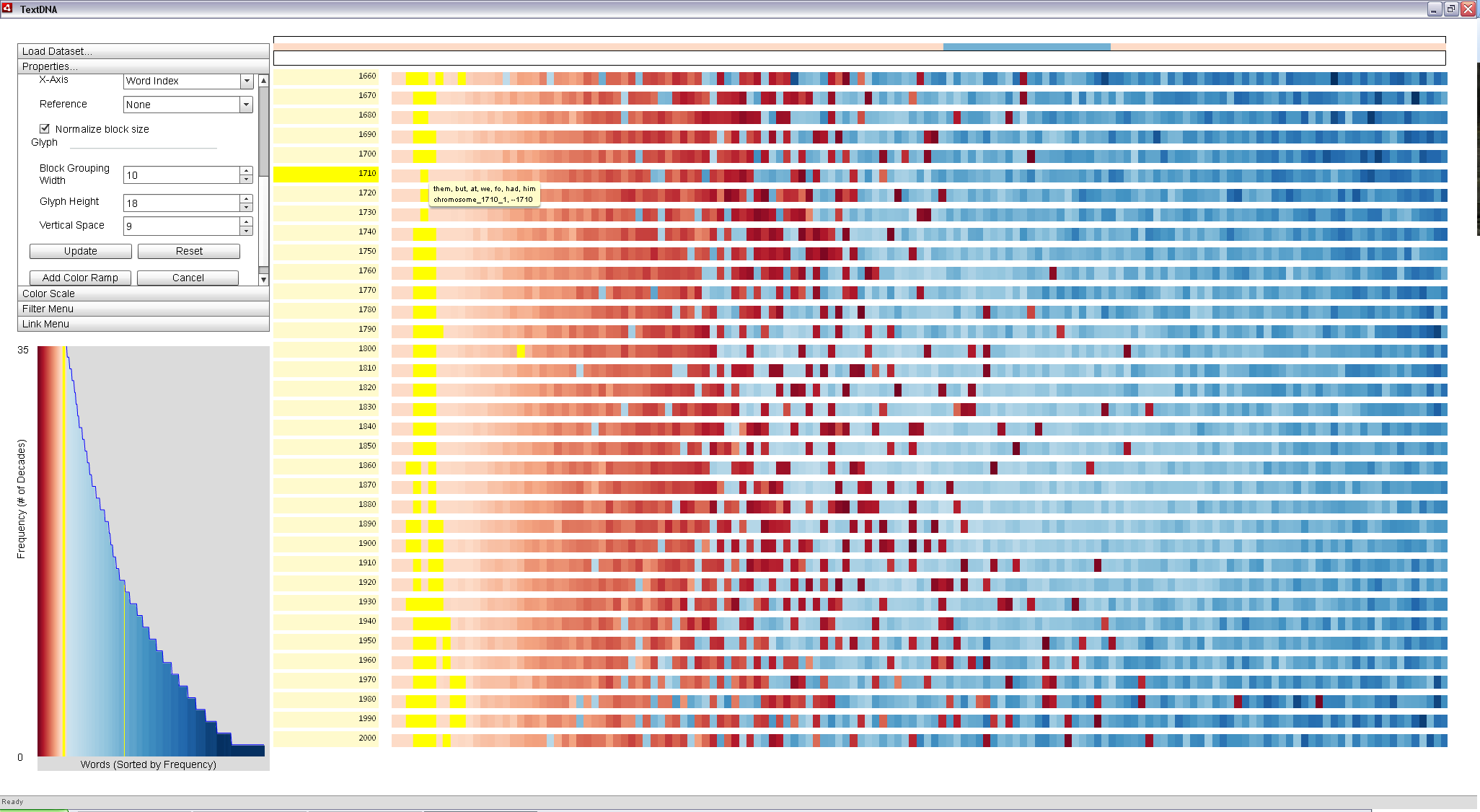
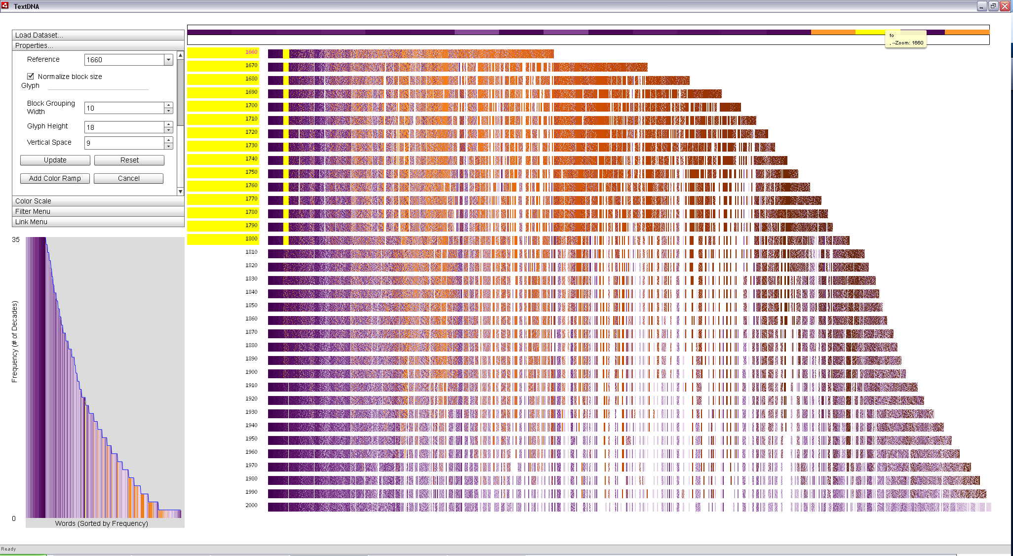
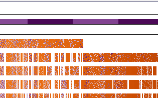
By mousing over the top 100 words in the earlier decades, we can get a sense of the lower-level co-occurance patterns in this part of the dataset. Mousing over a block causes its components to be broken down in the Zoom Window at the top of the display. When we zoom into the blocks at the far left of the display, we see several anomolous blue blocks appear in the Zoom Window, as in the image below. What these blue blocks suggest is that, while the majority of the top 100 most popular terms are shared between decades, there are several terms that are unique to a specific subset of the decades.
The tool tip reveals the terms in the block in the image below to be 'them', 'but', 'at', 'we', 'fo', 'had', and 'him'. It seems reasonable that most of these terms would be about as common in 1710 as in other decades, indicated by the fact that most of the highlighted blocks (i.e. those containing terms matching on of these words) form a tight column across the decades in the image below. However, the word 'fo' seems less likely to fall into this pattern.
|
| Mousing over a block causes its specific, unaggregated contents to be displayed in the Zoom Window. A blue term (the word 'fo') can be seen in the Zoom Window when mousing over a block that averages to red in the primary view. This suggests a potentially interesting term: 'fo' is among the most popular in 1660, but not even in the top 1,000 most popular in other decades. |
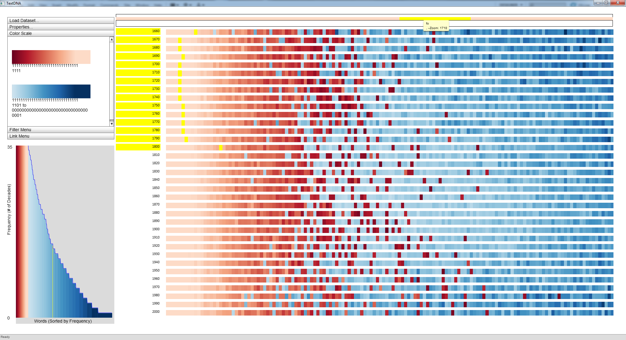
Right-clicking on the block and locking it to the Zoom Window allows us to interact with the individual terms within the block. Mousing over the blue term in the Zoom Window confirms the outlier to be the word 'fo'. The subsequent highlighting of locations of 'fo' in the datasets reveals that the term was quite popular (i.e. entirely in the leftmost portion of the display) from 1660 to 1800, but not even in the top 1,000 most popular words afterwards.
|
|
Locking a block to the Zoom Window allows us to explore patterns in the overall dataset with relation to single words. Here, mousing over 'fo' reveals other blocks containing 'fo', highlighted in yellow. The highlighted decades in the Label Bar indicate that 'fo' was popular between 1660 and 1800. |
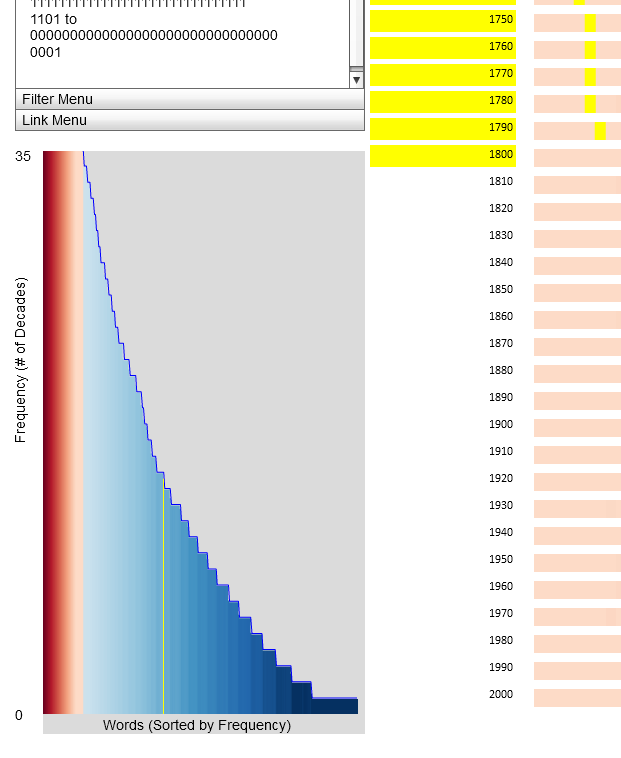
Mousing over 'fo' in the Zoom Window also highlights its location in the Histogram view. The Histogram allows us to quickly locate other words with identical frequency patterns.
|
| Mousing over a term in the Zoom Window reveals where in the overall frequency distribution of words in the dataset a particular term is found. Here, the yellow highlight reveals the location of 'fo' in the distribution. |
Mousing over the location of 'fo' in the Histogram brings up a tool tip revealing other terms with a similar frequency distribution: 'fhall', 'themfelves', 'alfo', 'againft', 'fhould', 'faid', 'himfelf', 'firft', and 'muft'. The corresponding highlighting in the primary display shows that these words are very popular between 1660 and 1800. The words all seem awkward to the modern tongue; however, the alternative spellings of 'shall', 'themselves', 'also', 'against', 'should', 'said', 'himself', 'first', and 'must' are far more popular terms.
These words are all examples of the 'Long S' convention. Roughly speaking, until 1800, typography used a long s character at times in place of an 's'. However, to the modern reader, this long s looks like an 'f'. As a result, the OCR programs used in part to build the Google N-Grams dataset interpreted instances of the long s as an 'f', creating words like 'fo' and 'faid'.
|
|
Interacting with the Histogram view allows us to explore popularity patterns of terms with a frequency distribution similar to that of 'fo'. For the above subset, all of the terms were relatively popular between 1660 and 1800, as shown by the dense highlighting in the upper left-hand side of the display. |
However, the general red color of the blocks containing these long s terms suggests that these terms are outliers and not the dominant trend in the display. Using the Average aggregation scheme hides outliers within the data. However, by using an Event Striping aggregation scheme, we can visually prioritize violations to the overall trend in each blocks. The result is a visualization that highlights irregularities in the data. In the image below, we use Event Striping to highlight long s words. There is a dense scattering of medium blue terms (i.e. those appearing in approximately 13 to 15 decades) in the left portion of 1660 through 1800. Since these terms appear to follow the pattern of the previously identified long s terms, they may be of interest.
 |
|
Using Event Striping emphasizes changes to the local trend of a block. This encoding reveals outliers, such as the long s words, that may otherwise be hidden by Average aggregation encodings. |
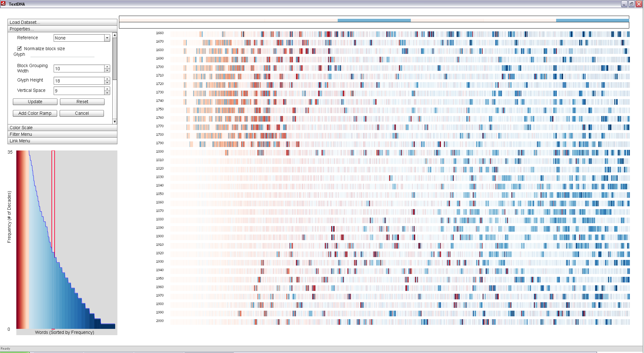
By clicking and dragging across the region of the frequency distribution in the histogram where several of the long s terms are found (i.e. frequency 15), we can quickly filter the main display to leave only blocks that contain at least one word in that frequency band, as seen in teh image below. These terms are primarily clustered to the left in decades before 1800. This clustering swings drastically to the right (i.e. less popular terms) after 1800.
This rapid swing suggests there is a significant change in the popularity of written words around this time (the aforementioned long s typography convention). While less popular words only appearing in the top 1,000 words in 40% of the decade is to be expected due to word death (a decrease in the use of a word), highly common words tend to be those central to written English, such as 'so', 'the', and 'and'. The fact that some of the highly popular words are only popular in this specific subset of decades suggests that there may be a significant portion of such words in the dataset.
|
|
Lasso-selection can be used to isolate certain portions of the overall frequency distribution for exploration. Here, all terms represented in the red box in the Histogram are filtered (words appearing in 15 decades). The pattern of these terms shifts drastically around 1800: prior decades cluster these somewhat infrequent terms in regions of popular words, while later decades see these terms clustered in far less popular regions. |
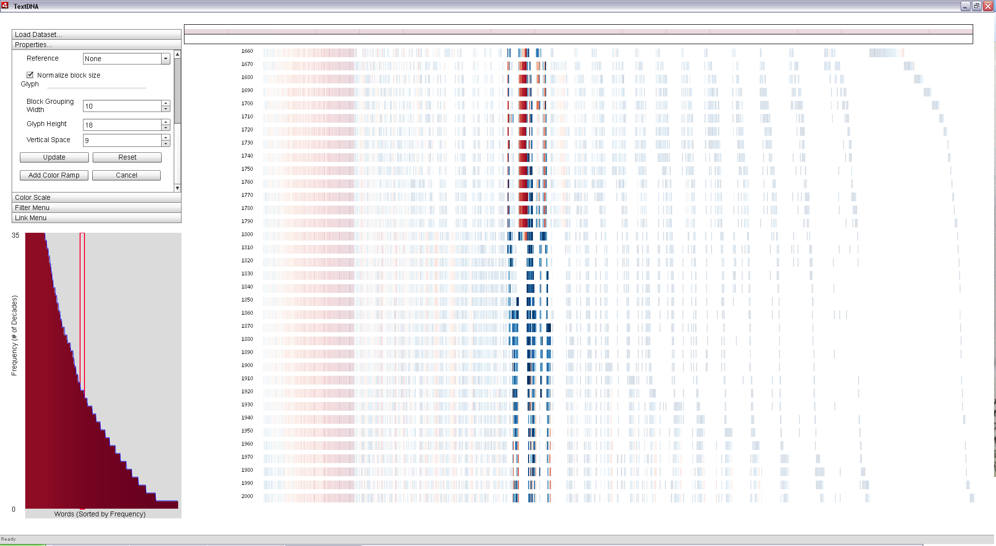
We can leverage TextDNA's sorting abilities to cluster these words together. Setting the X-Axis ordering to Grouped Frequency Ordering reorders the words by the subsets of decades in which they are popular. Words popular in all decades are placed in the leftmost columns, and the words in the subsequent columns are found in an increasingly smaller subset. Regions of white within a decade indicate columns of words absent from that decade (e.g. the rightmost columns are words unique to a single decade).
In turn, coloring by Word Index colors terms according to their popularity, with the most popular terms in a decade mapping to a dark red and the least popular to a dark blue. Therefore, words that are extremely popular, but only in a subset of decades will form red columns to the right of the display. From the Histogram filter above, we know that the terms that are left fully opaque are comprised of several such words (mostly examples of the long s phenomenon), as seen in the image below. The breadth of the column from 1660 to 1800 suggests that a significant portion of the filtered terms are, in fact, in this group. Mousing over this group allows us to see the exact words this column represents.
|
|
Reordering the terms according to their co-occurance patterns clusters terms popular in the same set of decades into columns. The red center column of the filtered terms represents words that were very popular between 1660 and 1800 and not within to top 1,000 in any subsequent decades. |
By changing back to an Average aggregation scheme and removing the Histogram filter, we can search for red columns representing regions where the majority of the words in that particular subset of decades are extremely popular. This allows us to closely identify major timeframes in which the long s typography convention was used.
While the leftmost red columns are expected (they represent terms that are both popular and common to all decades), there is also a narrow column of words that are reasonably popular in all but one decade from 1660 to 1800 and all but one from 1670 to 1800. These columns also appear to be predominantly composed of long s terms. The variation from the original filtered columns is likely due to the limited amount of data available for early decades like 1660 and 1670.
|
| Words are ordered according to the set of decades in which they are popular and colored according to their popularity (deep red is the most popular term). Terms on the far left are in every decade; those on the far right are unique to one decade. The three red columns near the center of the display (with terms between 1660 and 1800) represent regions that are predominantly very popular within a subset of decades, such as the long s words. Further interaction with the data reveals that most of the long s words are clustered in these columns. |
Historical Patterns in Modern Words
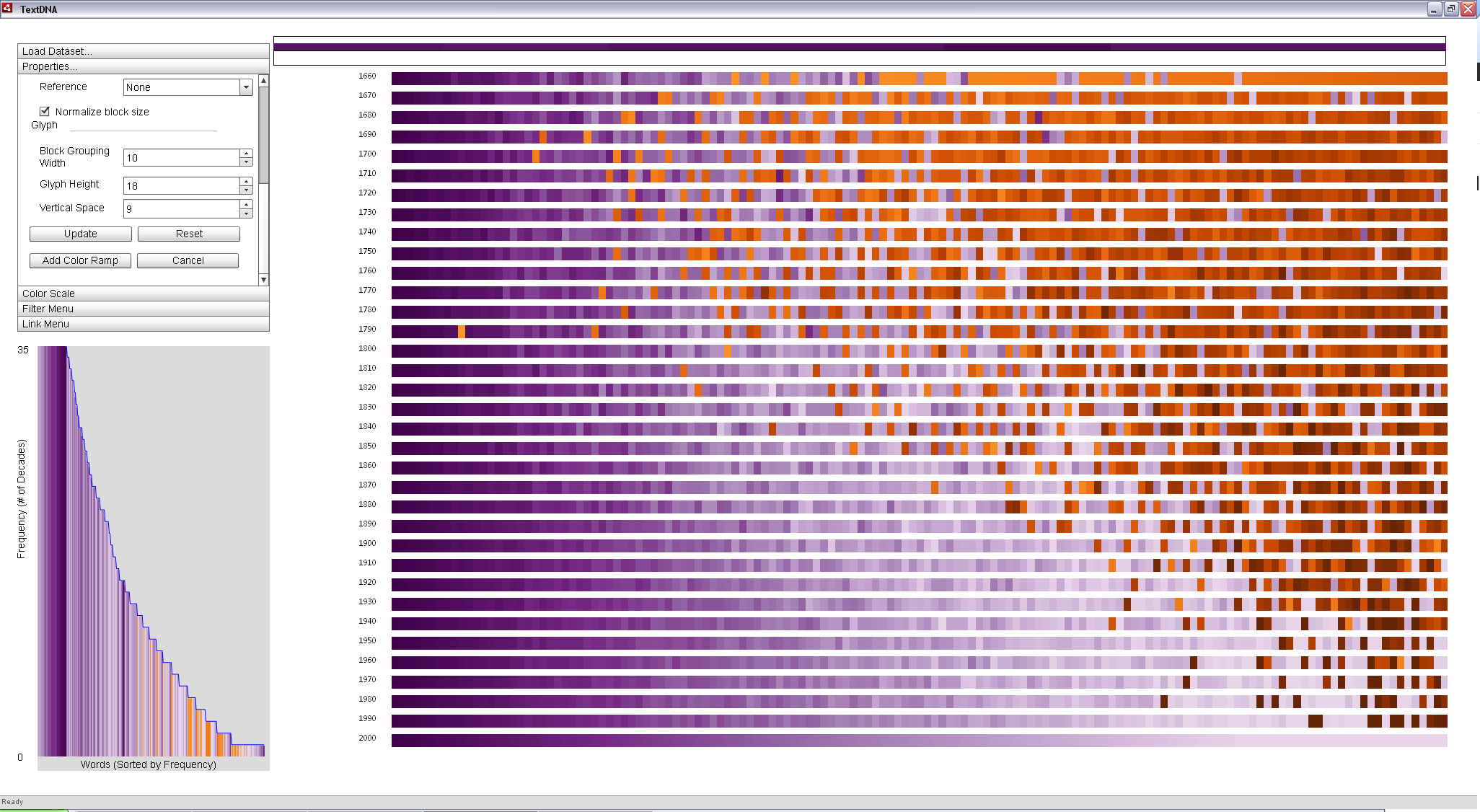
Position in Reference encodings can be used to make direct comparisons to patterns in particular decades. In the image below, we order words on the x-axis according to their Word Index (popularity rank within the decade). We color terms according to their Position in Reference and set the Color Reference to 2000. Since Position in Reference coloring uses a split color scheme (i.e. all of the terms in the top 1,000 in the reference decade map to one color and any other terms to a second), we can select opposing color schemes to enforce the visual contrast between these two groups. Below, all words in the top 1,000 most popular from 2000 to 2010 are colored in purple, with the darkest being the most popular and lightest the least, using Purple-Green as the primary color scheme. The sequence representing 2000 to 2010 thus becomes a continuous purple ramp. All words not popular in the decade of the 2000s are colored orange, according to their position in each decade aside from the reference, increasing in darkness in time and inversely with popularity.
By using an Average aggregation scheme, each block is represented according to the average of the dominant portion of the color values in the block. For example, if a block has more words in the reference decade, it is colored according to the average of all values within the block from the reference decade. Averaging gives a sense of the dominant patterns in the display, revealing a clear upper triangular pattern: as you look back in time, the decades have increasingly fewer popular words in common with the most recent decade.
|
|
Words among the 1,000 most popular from 2000 to 2010 according to the Google N-Grams data are mapped to purple, with darker purples being more popular in the 2000s. All other words are colored orange, with darker oranges representing terms that become popular in more recent decades. Averaging values within a block in the display conveys the dominant patterns in the data. |
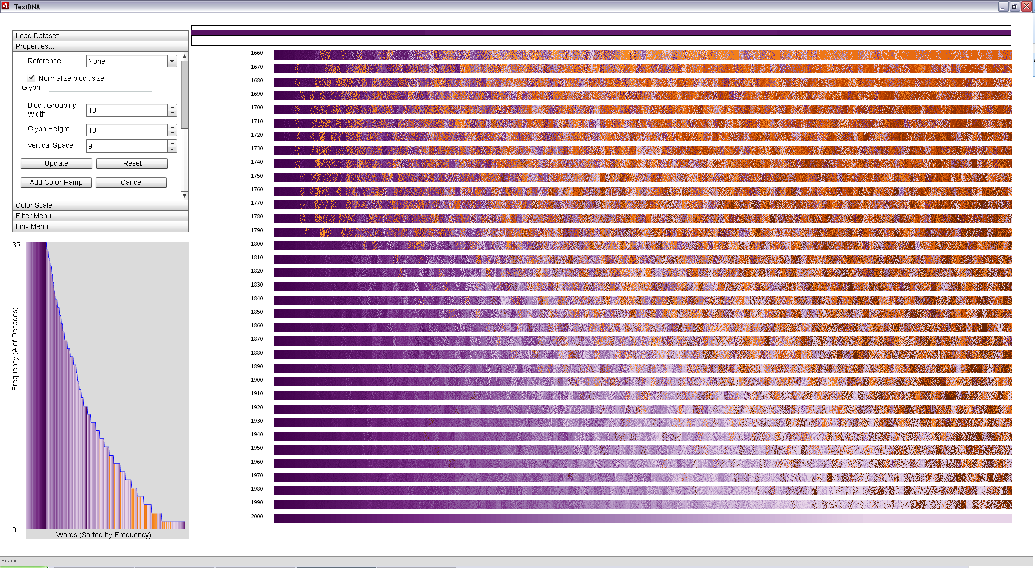
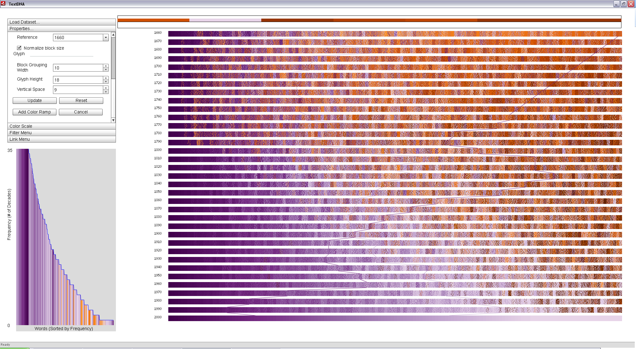
However, the Average aggregation scheme focuses only on dominant trends in the dataset. Switching to a Color Weaving aggregation scheme displays distribution information across the dataset. In a color woven glyph, the rectangle becomes a sort of quilt, with the distribution of pixel color values reflecting the distribution of word colors within the block. From the woven display, we can see that the upper triangular pattern in the averaged view is an oversimplification of the data: it is good for making overall judgements about patterns in the data, but at the cost of identifying small complexities within the data. Weaving supports the perception of high-level averages, but preserves the complexity of smaller details such that the viewer can more closely identify anomalies in the display.
The woven view suggests that several words not as popular in the 2000s may be terms whose popularity has been steadily decreasing since the mid 19th century, evidenced by an angled band of light purple across the center of the more recent decades in the display. It also suggests that a signfiicant portion of the terms that were popular between 1660 and 1790 are not popularly used today. Interaction reveals several of these terms to be a byproduct of the long s typography convention explored in the previous example.
|
|
Aggregations based on Color Weaving provide a distribution-based encoding of the data. A quick glance reveals high-level pattern information; closer inspection allows more rapid access to details. |
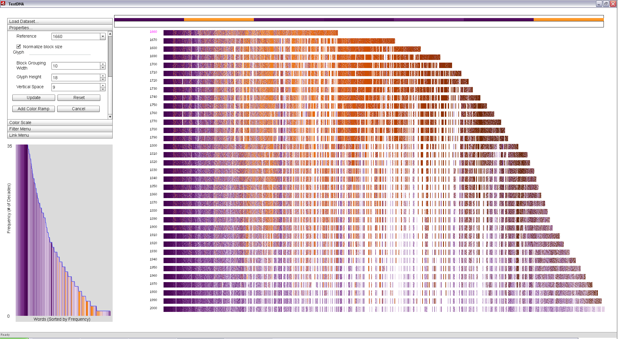
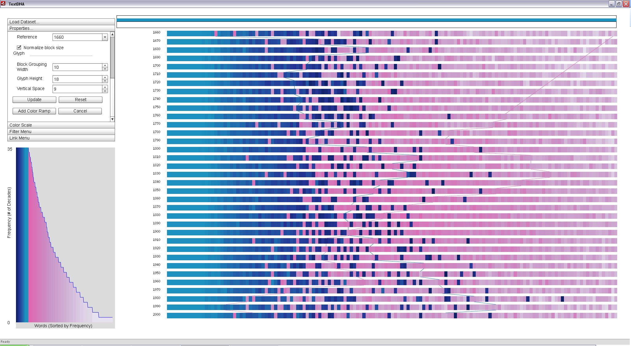
To explore more of the fluctuation of terms between 1660 and the present, we can set 1660 as the x-axis reference and set the x-axis ordering to Position in Reference. Every word that is in the top 1,000 most popular in 1660 is located in the columns beneath the top-most bar in the primary display. All other terms are found to the right of the bar, ordered according to their position in the remaining decades, considered chronologically. The resulting display supports the direct comparison of popularity patterns with the earliest decade through position and the most recent through color simultaneously.
The thick orange fields between 1660 and 1800 are dominanted by the long s and words that have fallen out of vogue in the modern vernacular. However, the leftmost (most popular) instance of orange in 1660 appear to exhibit a consistent fall-off in less modern terms across the three centuries represented in the dataset. It is most dense before 1800, becomes less dense up to 1900, and become entirely modern after 1900. The leftward location of the cluster combined with the deep purple color of the remainder of the distribution suggests that these terms may be interesting as they are both popular in 1660 and 2000.
|
|
Clustering according to 1660 supports the direct comparison of popularity patterns between the earliest and latest decades in the dataset within the context of the overall data. |
Locking this column to the Zoom Window reveals the identify of the less modern terms in this particular block: 'thou', 'unto' and 'fo'. While 'thou' and 'unto' are terms that have fallen out of vogue in modern text, 'fo' is and instance of a long s term. Therefore, the change in typography explains the density shift at 1800. 'Thou' and 'unto suggest the possibility of another signifncant shift in language around 1900.
   |
|
Interacting with individual blocks in the image allows the user to explore patterns of interesting terms in context. In the top two images, we quickly see that 'thou' and 'unto' faded out of popular use after 1900; however, 'fo', an equally popular term in 1660, fell out of use in 1800, indicative of a change in typographic convention occuring around that time. |
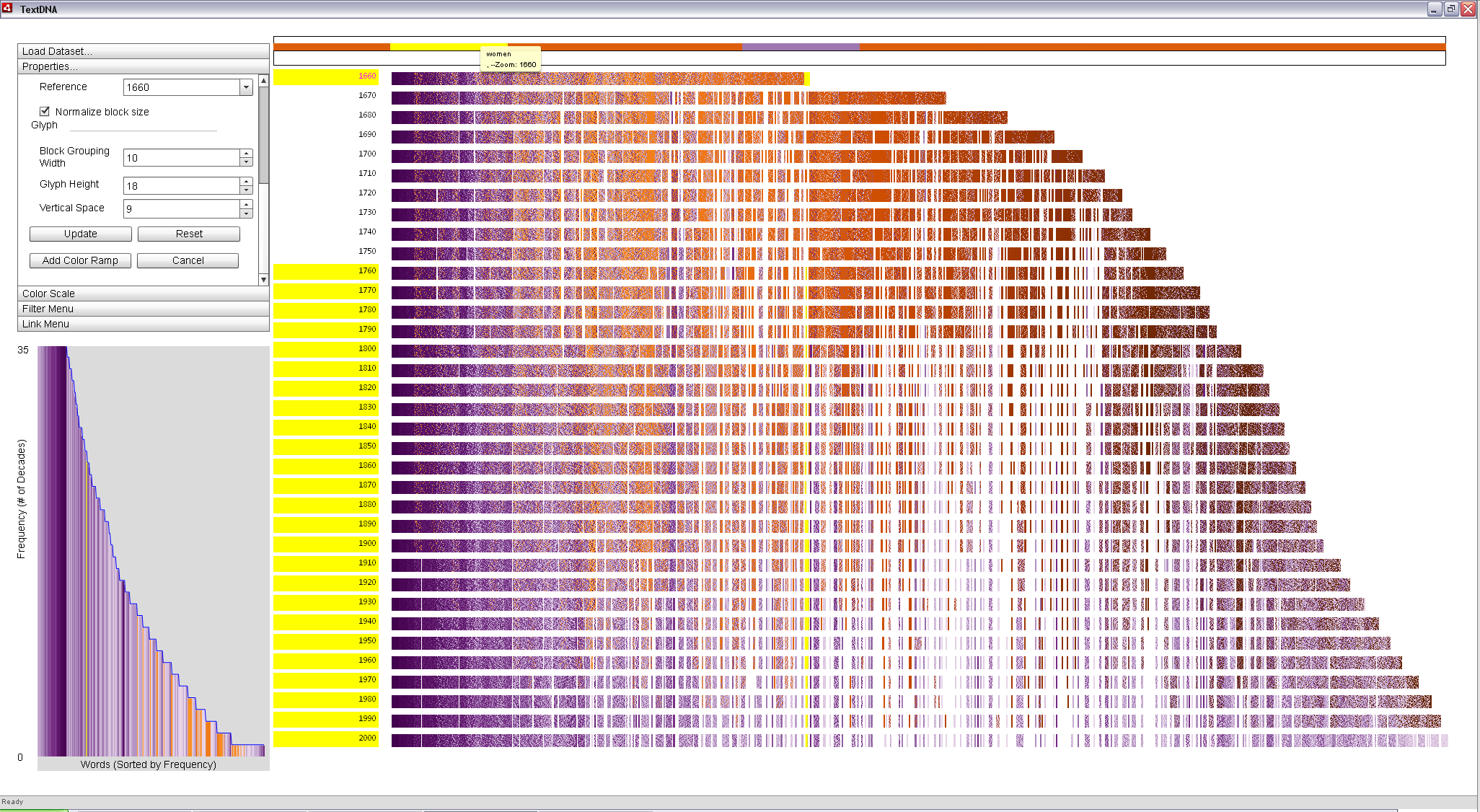
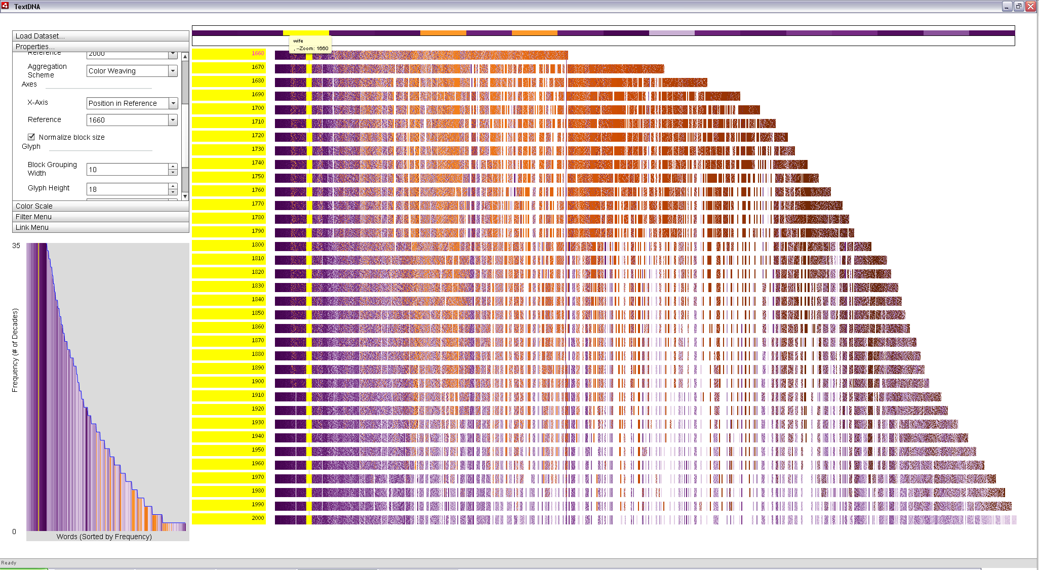
Among the least popular terms in 1660 is a single dark purple word (see below). This word represents a term that was extremely popular from 2000 to 2010 but barely in the top 1,000 most popular terms in 1660.
|
|
Color weaving keeps detailed trends within a sequence visible. The final block in the top row (1660) contains some dark purple, suggesting a significant change in its use overtime. |
Locking the block to the Zoom Window allows us to explore the individual words in the block. The purple term is the word 'women'. Mousing over the purple word in the Zoom Window highlights the decades in which the term was among the 1,000 most popular in the Label Bar. This analysis reveals that the term was popular in 1660, but did not again enter the top 1,000 most popular until 1760. Clicking on the purple block links instances of the word throughout the primary display.
|
|
The popularity trend of the word 'women' is highlighted in yellow. The Label highlighting to the left of the primary display indicated that the word was not among the top 1,000 most popular between 1670 and 1750. |
Conversely, the word 'wife' is extremely popular in 1660, as its leftward position in the display indicates. Locking it to the Zoom Window and again brushing across the term highlights all of the decades in the Label Bar, indicating that it is in among the 1,000 most popular words in each decade of the dataset. However, its lighter purple color suggests that it is less popular than the word 'women' in modern writing. Clicking the word in the Zoom Window again links the term in the primary display.
|
|
The popularity of the word 'wife' is highlighted above. The highlighting suggests it was popular in all decades; its position at the left of the display indicates it was especially popular in 1660. Clicking on the word in the Zoom Window connects the term throughout the dataset with a solid line. |
Switching the x-axis ordering back to Word Index displays the shift in the popularity of the two terms over time: the terms are still connected in the primary display, but the path of the connected terms reveals specific information about the popularity shift of 'wife' and 'women' in relation to other terms.
|
|
Ordering by popularity changes the path of the connected terms: the rise and fall of the popularity of 'women' and 'wife' can be traced by following the line through time. |
We can leverage the properties of the primary display to better analyze the popularity trends of these two words in the context of the overall dataset. Changing the aggregation scheme back to Average reduces the density of information displayed on the screen. In doing such, the lines become more salient as the blocks are again reduced to single-color glyphs.
We can also take advantage of the fact that 'women' appears in a subset of the decades to help highlight these connections. Coloring according to co-occurance patterns (Grouped Frequency Ordering) supports a split ramp over the frequency patterns in the dataset: all words that are popular in every decade map to the primary color scheme, whereas all other words map to the secondary color scheme. This split allows us to again choose two contrasting color schemes and each term is mapped to a separate ramp. The primary color scheme is set to Yellow-Green-Blue and the Reverse Ramp checkbox is checked to leverage the darker portion of the map such that a dark blue line traces the popularity of 'wife'. The secondary color scheme is set to Purple-Red Sequential, such that a pink traces the popularity of 'women' in the context of the entire dataset. A line crossing over a decade implies that the crossed decade does not contain the connected term in the top 1,000 most popular of its decade.
|
|
The trend lines can be made more salient by leveraging the relative frequency of each word in the data. Aggregating across dominant trends reduces the visual complexity of the scene such that the lines become more visible. |
Filters can be used to futher highlight the pattern of these two terms in the context of the data. Going to the filter menu and using "wife, women" as the filter term reduces the opacity of all blocks not containing one of either 'wife' or 'women', but retains the background blocks at an increased transparency to preserve context. The resulting display facilitates tracing the popularity trends of the two words through time ('wife' by the blue line and 'women' by the pink). We can see that women becomes more popular than wife starting around 1910, a time when women's rights were a hot issue and a decade in which women earned the right to vote. Prior to that decade, all blocks containing the word 'women' were predominantly composed of words that were not common to all decades; a trend mirrored in the term 'wife' after 1910.
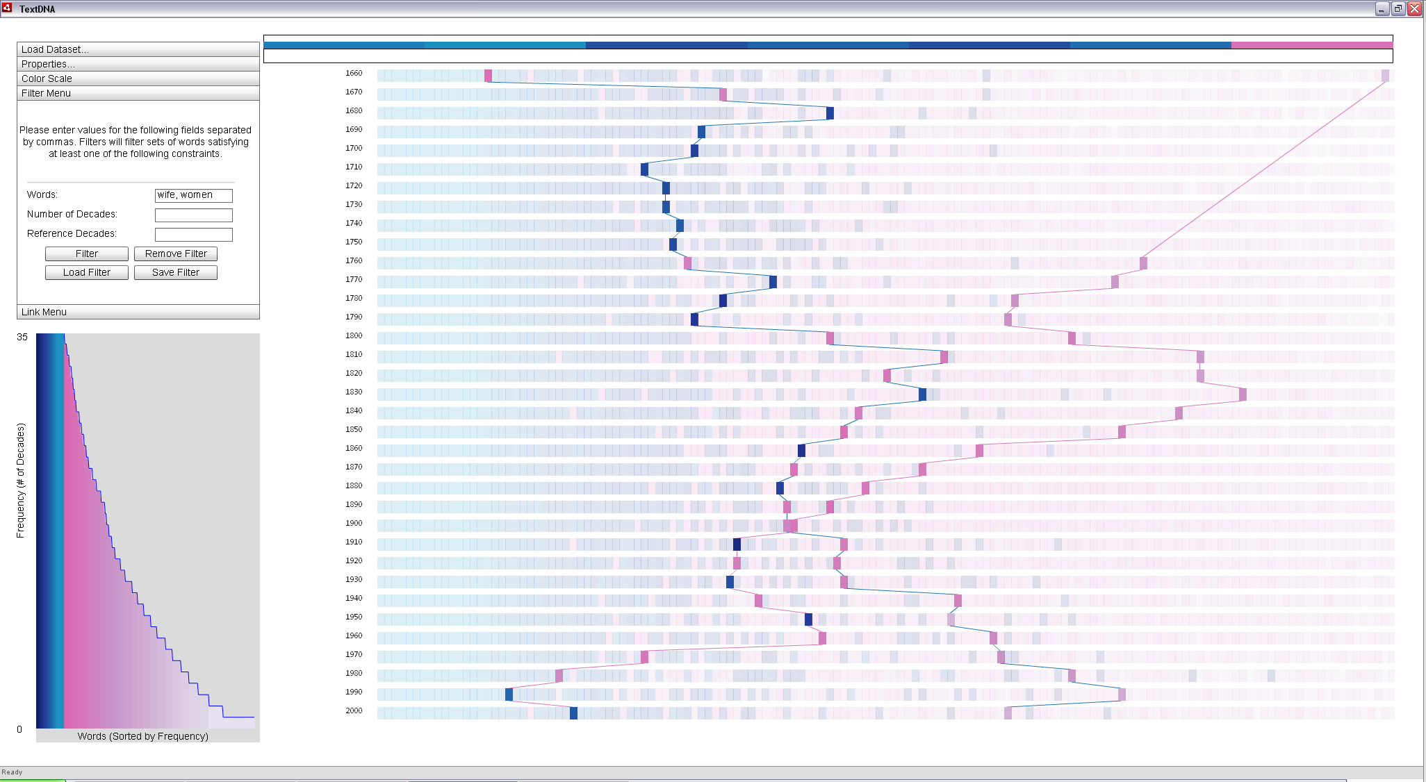
|
|
Filtering based on specific terms makes it easy to see the patterns in popularity of the two words. The connections visually distinguish blocks containing each term. The color of the blocks connecting the point suggest the patterns of words of similar popularity to the target term: blue blocks predominantly contain words common across all decades, where as pink blocks are increasingly less common, as indicated in the Histogram. |
The above examples provide a brief introduction to using TextDNA for the visual exploration of sequence-based datasets. A more comprehensive listing of the features of the tool as well as details about each feature setting can be found in the User's Guide. All of the examples discussed here use features available by default in the display. TextDNA also provides support for exploring any numeric features provided by the user in the database and for using custom color schemes.
Project Page | Sequence Surveyor | TextDNA
Adobe AIR must be installed to run Sequence Surveyor and TextDNA.
Email dalbers@cs.wisc.edu for more information.